")
How Can We Help?
📊 Understanding Chart Descriptions
The May 2024 release of Take5™️ Connect introduces a comprehensive set of charts across various modules, enhancing your ability to visualize and analyze safety data. This guide provides descriptions of each chart type available within the platform. 👇
🧭 Accessing the Chart Descriptions
To view the chart descriptions:
- The Dashboard Module allows users to filter charts by date range and/or selected sites.
- The Multi-Account Dashboard allows users to filter charts by date range and/or selected accounts that they are associated with.
🗂️ Exploring Chart Types by Module
Each module in Take5™️ Connect offers specific chart types designed to visualize relevant data:
📊 Access Activities Charts
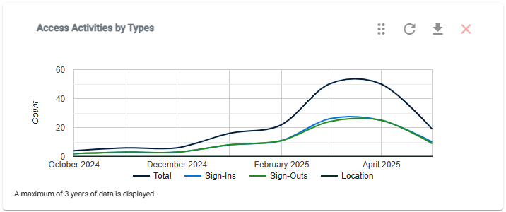
- Access Activities by Type (Line Chart): Displays a monthly summary of user sign-in and sign-out activities, including location-based activities.
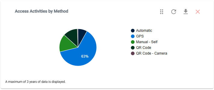
- Access Activities by Method (Pie Chart): Breaks down the methods used for site access.
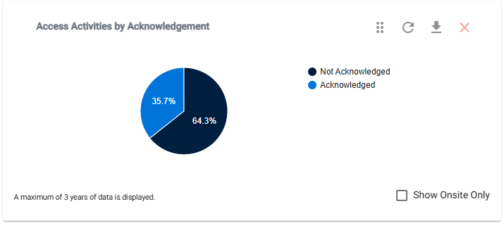
- Access Activities by Acknowledgement Status (Pie Chart): Shows the percentage of users who acknowledged their sign-in over time.
📊 Forms Charts
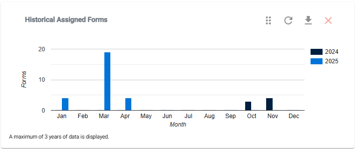
- Historical Assigned Forms (Bar Chart): Summarizes forms assigned to users over time.
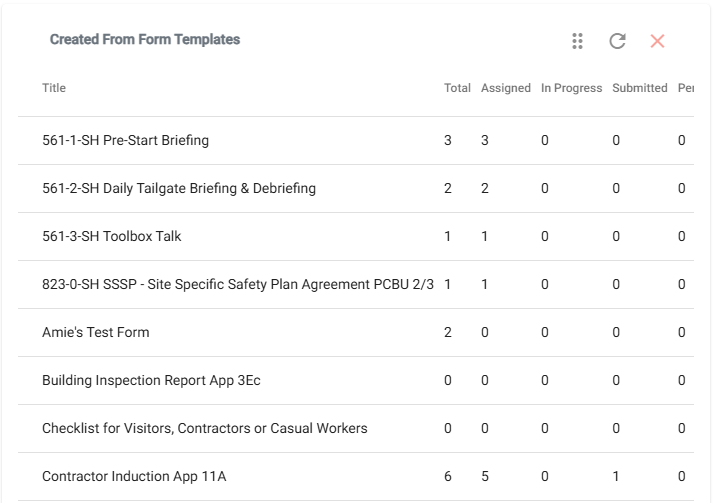
- Template Forms Stats (Data Table): Provides counts of assigned forms grouped by status.
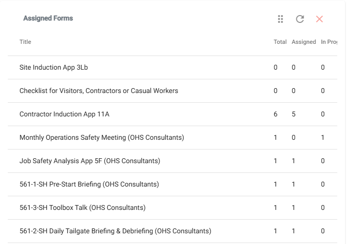
- Assigned Forms Stats (Data Table): Displays counts of all assigned forms grouped by status.
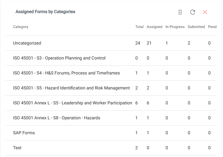
- Assigned Forms by Categories Stats (Data Table): Shows counts of assigned forms grouped by status for each category.
📊 Hazards & Risks Charts
- Historical Hazards & Risks (Bar Chart): Summarizes hazards reported across all sites by month.

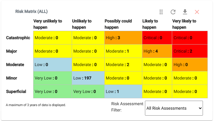
- Risk Matrix (Data Table): Displays counts of hazards for each risk level.
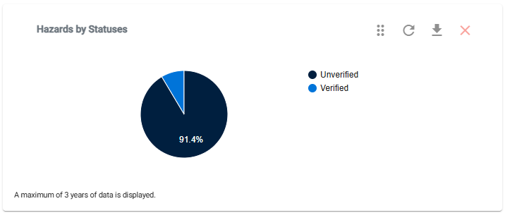
- Hazards & Risks by Status (Pie Chart): Breaks down hazards by verification status.
📊 Incidents Charts
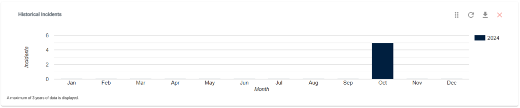
- Historical Incidents (Bar Chart): Summarizes incidents reported by month.

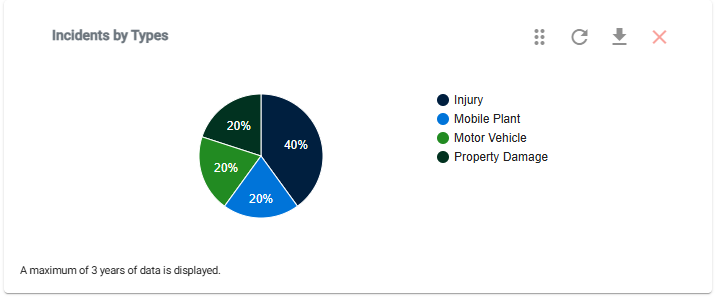
- Incidents by Types (Pie Chart): Breaks down incidents by type.
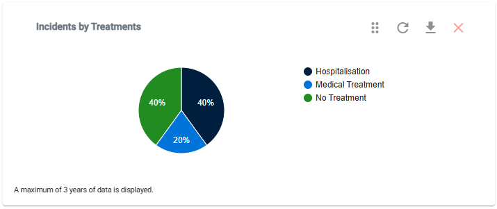
- Incidents by Treatments (Pie Chart): Displays incidents grouped by treatments.
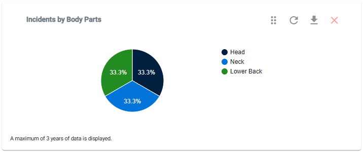
- Incidents by Body Parts (Pie Chart): Shows incidents grouped by affected body parts.
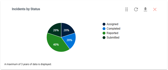
- Incidents by Status (Pie Chart): Breaks down incidents by status.
- Incidents Stats (Data Table): Provides a summary of total incidents, Lost Time due to Injury (LTI) incidents, and completion status.
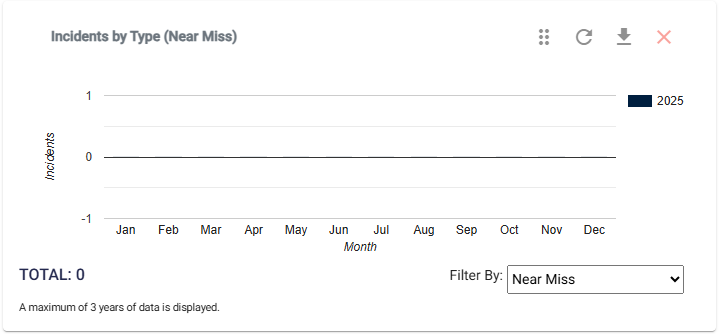
- Incidents by Type (Bar Table): Displays incidents grouped by a selected type.
📊 Inductions Charts
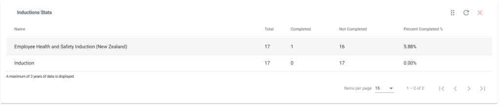
- Inductions Stats (Data Table): Summarizes information on users assigned to inductions and their completion status.
📊 Inspections & Audits Charts
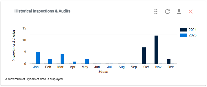
- Historical Inspections & Audits (Bar Chart): Summarizes inspections and audits by month.
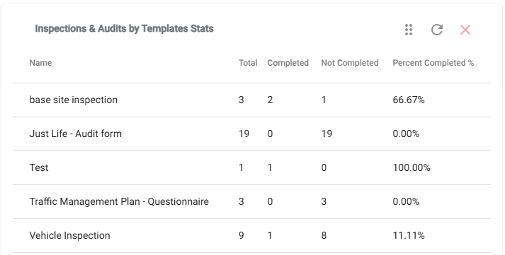
- Inspections & Audits by Templates Stats (Data Table): Shows inspections and audits created from templates, including completion status.
📊 Messages Charts
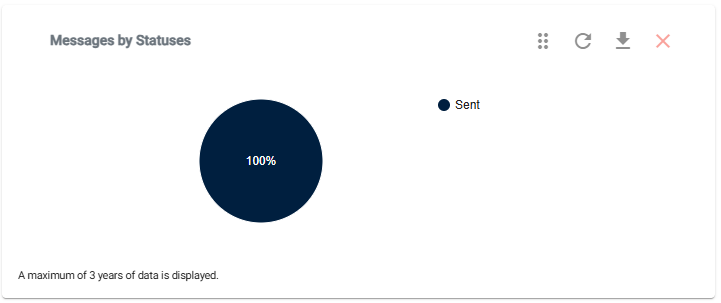
- Messages by Status (Pie Chart): Breaks down messages by status.
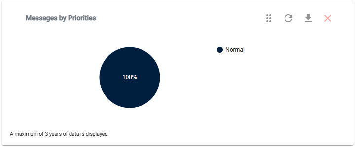
- Messages by Priorities (Pie Chart): Displays messages grouped by priority.
- Messages by Types (Pie Chart): Shows messages grouped by type.

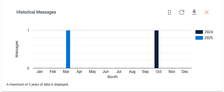
- Historical Messages (Bar Chart): Summarizes messages sent by month.
📊 Safety Observations Charts
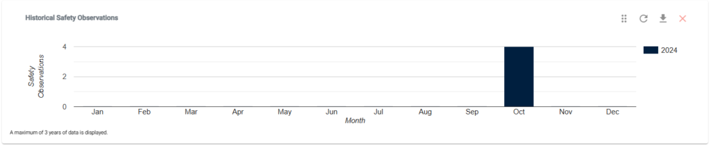
- Historical Safety Observations (Bar Chart): Summarizes safety observations reported by month.
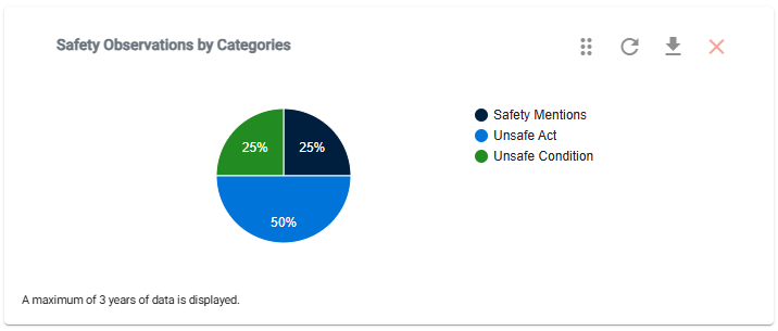
- Safety Observations by Category (Pie Chart): Breaks down observations by category.
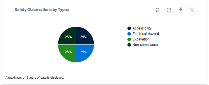
- Safety Observations by Types (Pie Chart): Displays observations grouped by type.
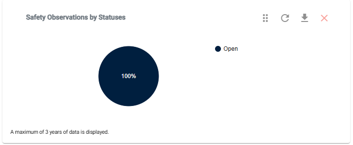
- Safety Observations by Statuses (Pie Chart): Shows observations grouped by status.
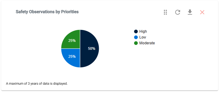
- Safety Observations by Priorities (Pie Chart): Breaks down observations by priority.
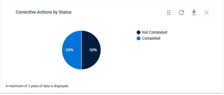
- Safety Observations Corrective Actions by Statuses (Pie Chart): Displays corrective actions associated with observations, grouped by status.
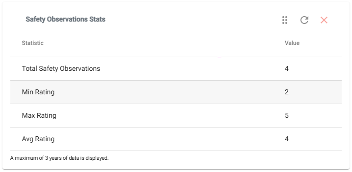
- Safety Observations Stats (Data Table): Provides a summary of reported safety observations, including minimum, maximum, and average ratings.
📊 Sites Charts
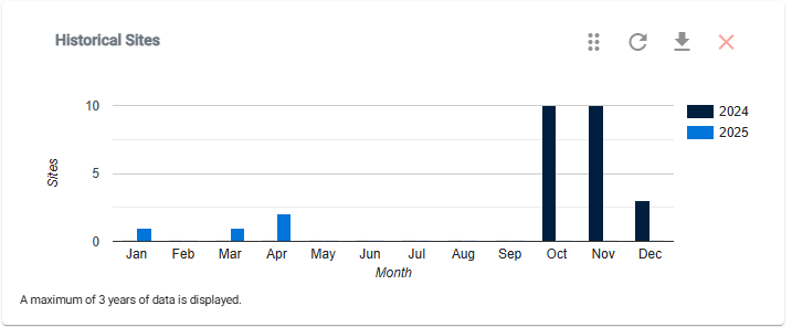
- Historical Sites (Bar Chart): Summarizes sites by month.
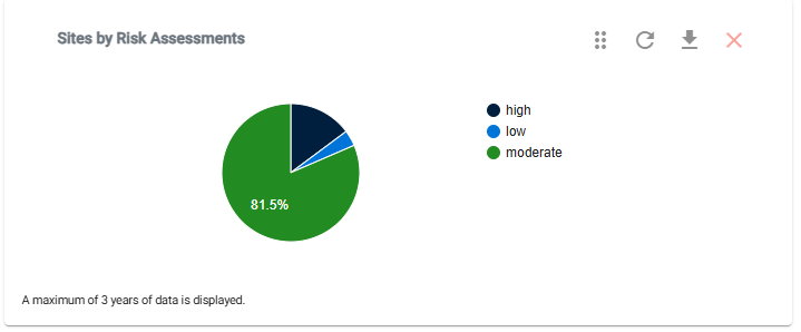
- Sites by Risk Assessments (Pie Chart): Breaks down sites by risk assessment levels.
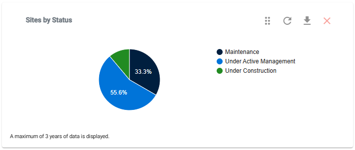
- Sites by Status (Pie Chart): Displays sites grouped by status.
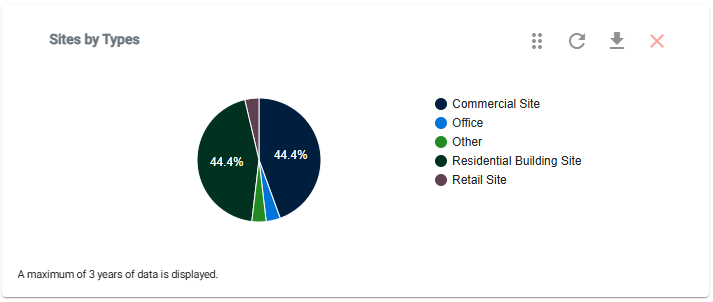
- Sites by Types (Pie Chart): Shows sites grouped by type.
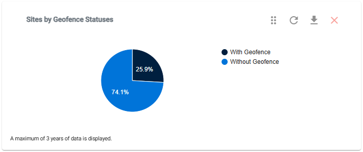
- Sites by Geofence Status (Pie Chart): Breaks down sites by geofence status.
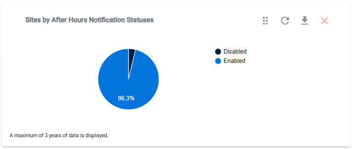
- Sites by After Hours Notifications (Pie Chart): Displays sites grouped by after-hours notification status.
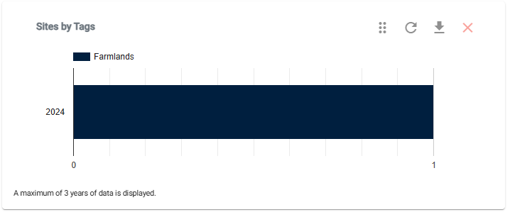
- Sites by Tags (Stacked Bar Chart): Shows sites grouped by tags over time.
📊 Tasks Charts
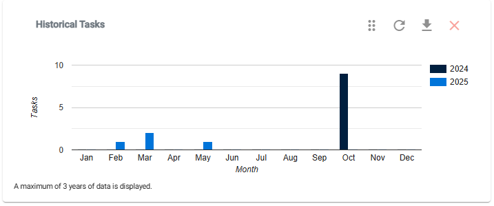
- Historical Tasks (Bar Chart): Summarizes tasks by month.
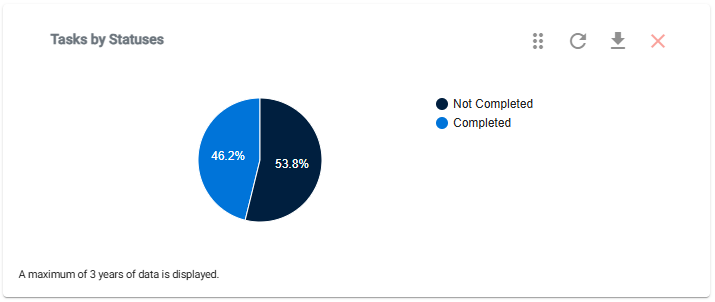
- Tasks by Status (Pie Chart): Breaks down tasks by status.
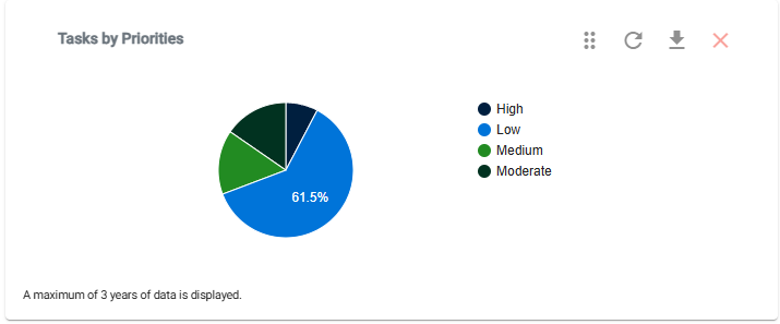
- Tasks by Priorities (Pie Chart): Displays tasks grouped by priority.
📊 Toolbox Talks Charts
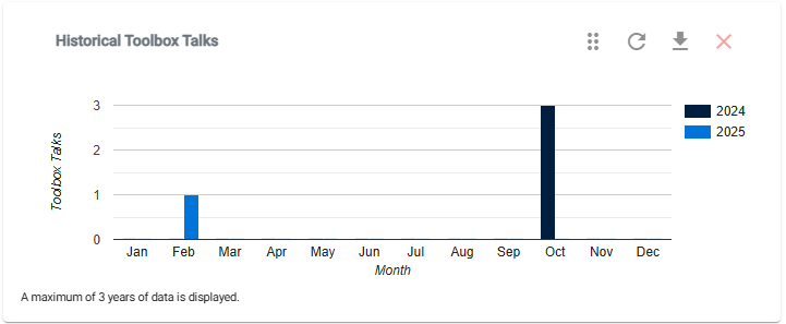
- Historical Toolbox Talks (Bar Chart): Summarizes toolbox talks by month.
📞 Need Help?
If you need further assistance, please contact our support team:
📧 Email: support@take5connect.com
📞 Phone (NZ): 0800 582 535