")
How Can We Help?
-
Account
- 👨💼 How to Change Your Username, Email, Password and Employer
- 🧑💼Download the Mobile App (Google Play Store and Apple App Store)
- 🧑💼 How to Enable or Disable Automatic Sign-Outs for Your Sites
- 🧑💼 How to Make Someone Your Main Contact
- 🧑💼 How to Add a Company Logo to Your Account
- 🧑💼 How to Enable or Disable Notifications
-
Charts & Graphs
- 📊 How to Create and Manage Dashboard Charts
- 📊 How to Create and Manage Charts & Graphs
- 📊 How to Access and Manage Sites Charts & Graphs
- 📊 How to Access and Manage Account Inductions Charts & Graphs
- 📊 How to Access and Manage Incidents Charts & Graphs
- 📊 How to Access and Manage Tasks Charts & Graphs
- 📊 How to Access and Manage Safety Observation Charts & Graphs
- 📊 How to Access and Manage Form Charts & Graphs
- 📊 How to Access and Manage Hazards & Risks Charts & Graphs
- 📊 How to Access and Manage Audits & Inspections Charts & Graphs
- 📊 How to Access and Manage Toolbox Talk Charts & Graphs
- 📊 How to Access and Manage Site Activity Charts & Graphs
- 📊 How to Access and Manage Messages Charts & Graphs
- 📊 Understanding Chart Descriptions
-
Contractors
-
Digital Signatures
-
Employees
- 👷♀️How to Add Employees as Managers of Sites
- 👷♀️How to Add and Manage Employees
- 👷♀️How to Import and Export Employee Details
- 👷♀️How to Add Training & Competency Details and Certificates to an Employee's Profile
- 👷♀️Unlocking a User After Multiple Failed Login Attempts
- 👷♀️Accessing User Profiles
-
Form Builder
- 📋 How to Use Form Categories
- 📋 How to Set Up Reoccurring Forms
- 📋 How to View and Link Forms to Sites
- 📋 All About Form Settings
- 📋 Setting Up Form Notifications
- 📋 Exporting Forms
- 📋 Assigning Forms
- 📋 Creating Forms and Inductions
- 📋 Approving, Rejecting Form Responses, and Viewing Audit Logs
- 📋 Adding Images and Videos into Forms and Inductions
- 📋 Viewing, Assigning, and Unassigning Forms
- 📋 Adding Display Conditions to Forms
- 📋Completing Forms and selecting Form Templates
- 📋How Forms are typically processed
-
Hazards/Risks
-
Incidents
-
Inductions
-
Inspections/Audits
-
Messages
-
My Pre-Qualifications
-
TA/JSA/SWMS
-
Tasks
-
Templates
-
Reporting
-
Sites and Subsites
-
Safety Observations
-
Take5™️ Connect Mobile App
- 📱 How to Report a Hazard or Risk via the Mobile App
- 📱 How to Enable or Disable GPS Tracking in the Mobile App
- 📱 How to Add Training/Competency Documents to Your Profile in the Mobile App
- 📱 How to Enable and Disable Notifications in the Mobile App
- 📱 How to Access the Admin Menu in the Mobile App
- 📱 How to Add Multiple Files in the Mobile App
- 📱 How to Sign Into the Mobile App
- 📱 How to Create a Toolbox Talk in the Mobile App
- 📱 How to Access Your Inductions in the Mobile App
- 📱 How to Complete a Task Assigned to You in the Mobile App
- 📱 How to Create a Task in the Mobile App
- 📱 How to Complete Approved Work from a Form in the Mobile App
- 📱 How to Select a Form Template in the Mobile App
- 📱 How to Complete Forms via the Mobile App
- 📱 How to Report a Safety Observation in the Mobile App
- 📱 How to Report an Incident through the Mobile App
- 📱 How to Conduct an Audit through the Mobile App
- 📱 How to Use Geofencing in the Mobile App
- 📱 Geofencing: Philosophy of Operations in Take5™️ Connect
- 📱 Troubleshooting GPS Issues in the Mobile App
- 📱 How to Sign Into a Site via QR Codes in the Mobile App
- 📱 Why Take5™️ Connect Requires Background Location Access
- 📱 How to Delete Your User Profile in the Mobile App
- 📱 How to Update Your Login Credentials and Employer in the Mobile App
- 📱 How to Download and Set Up the Take5™️Connect Mobile App
- 📱 How to Complete the Daily Site Hazard & Noticeboard Message Acknowledgment
- 📱 How to Manually Sign Out of a Site in Mobile App
- Show Remaining Articles (12) Collapse Articles
-
Sites
- 🏢 How to Create a Site
- 🏢 How to Clone a Site
- 🏢 How to List, Remove or Archive Sites
- 🏢 Emergency Evacuation Plans
- 🏢 How to Add a Noticeboard Message to a Site
- 🏢 How to Add & Remove a Document to a Site
- 🏢 Managing Site Toolbox Talks
- 🏢 How to Create, Update, Print, or Delete QR Codes
- 🏢 How to Claim a QR Code
- 🏢 How to Scan a QR Code Using Your Phone Camera
- 🏢 How to Create a QR Code for a Site or Multiple Sites
- 🏢 How to Manage Task Analysis Documents for Existing Sites
-
Safety Plans
-
Safety Protocols
-
Notifications
< All Topics
Print
📊 How to Access and Manage Messages Charts & Graphs
PostedMay 5, 2025
UpdatedJune 4, 2025
ByAmie
Visualizing message data through charts and graphs enhances communication tracking and decision-making. This guide will walk you through the steps to access and manage these visual tools within Take5™️ Connect. 👇
Step 1: 🧭 Navigate to the Messages Tab
- From the main dashboard, click on the Messages tab.
- Locate the option called Charts in the top right corner.
- Click on the + button and select how many columns (1–4) you’d like for the row layout.
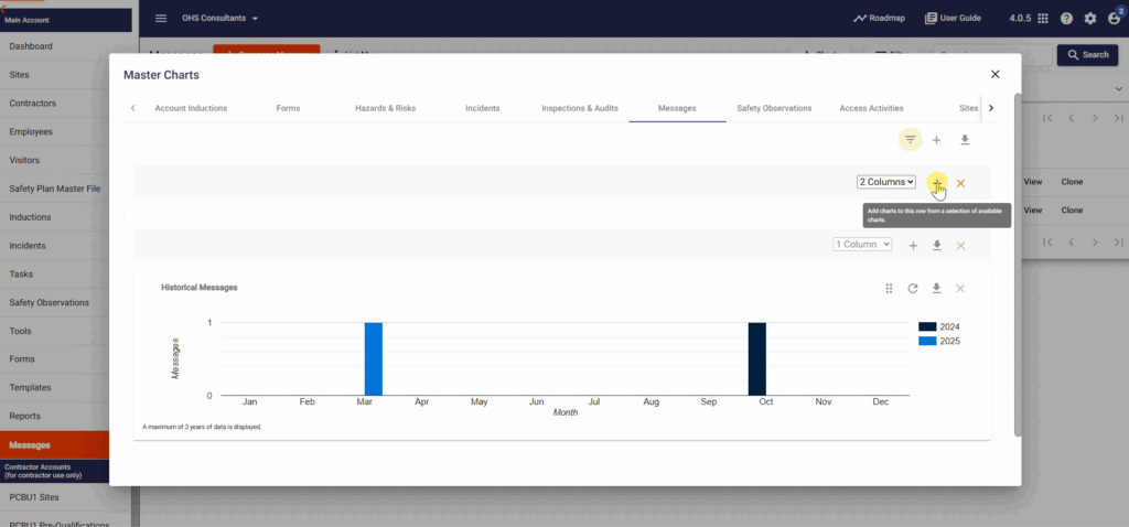
Step 2: ➕ Add Charts & Graphs
- Once the chart view is open, hover over the + button on the right-hand side.
- A dropdown menu will appear showing available chart types:
- PIE: Statuses
- PIE: Priorities
- PIE: Types
- Combo Chart: Historical Data
- Choose the desired chart to insert it into your dashboard layout.
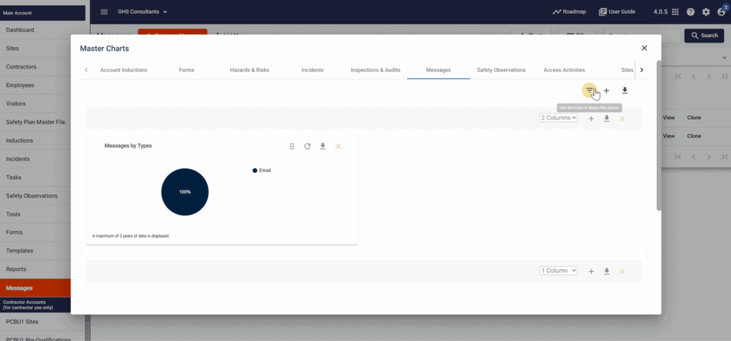
Step 3: 🔄 Filter and Set Date Range
- Click on the Filter button at the top-right corner of the screen.
- A pop-up will appear where you can:
- Select the Type of message; Email, Push Notification, SMS
- Select the Status of the message; Draft, Queued, In Progress, Sent
- Select the Priority of the message; Low, Normal, High, Critical
- Filter through the date created or scheduled
- Or set your desired date range
- If no date is selected, the system defaults to showing the past three years of data.
- Click Apply Filter to confirm your selections.
📝 Note: Filters apply to the entire module. Individual charts, rows, or columns cannot be filtered separately.
📌 Tips for Managing Charts & Graphs
- If you leave the module and return later, your previously configured chart view will still be visible.
- To remove a chart, hover over the top-left corner of the chart and click the X icon.
- To add another chart, click the + button again and follow the previous steps.
📞 Need Help?
If you need further assistance, please contact our support team:
📧 Email: support@take5connect.com
📞 Phone (NZ): 0800 582 535